Custom Cycling Kit Design Inspiration: 10+ Team Jersey Ideas for 2026
A custom cycling kit is the most visible thing a team or a brand will ever own. Long after the race is over, the jersey is still in the photo, still on the cafe ride, still telling people who you are. If you are planning a new kit for 2026, the hard part is rarely the printing—it is deciding what the kit should actually look like. This guide walks through more than ten design directions that teams and brands are asking for right now. Each direction here can be produced with full-sublimation printing and our standard fabric zones, so the jump from idea to delivered jersey is shorter than you might think.
Why the right design direction matters more than the artwork itself
Most teams start by hunting for a perfect image, but the image is only the last step. What actually decides whether a kit looks good is the direction: the color family, the placement of contrast, and the story the kit tells about the group wearing it. A clear direction lets a manufacturer's artwork team build a print-ready proof even when your own artwork is rough. That is why this guide leads with directions rather than files—choose a direction first, and the artwork follows.
1. Gradient fade kits
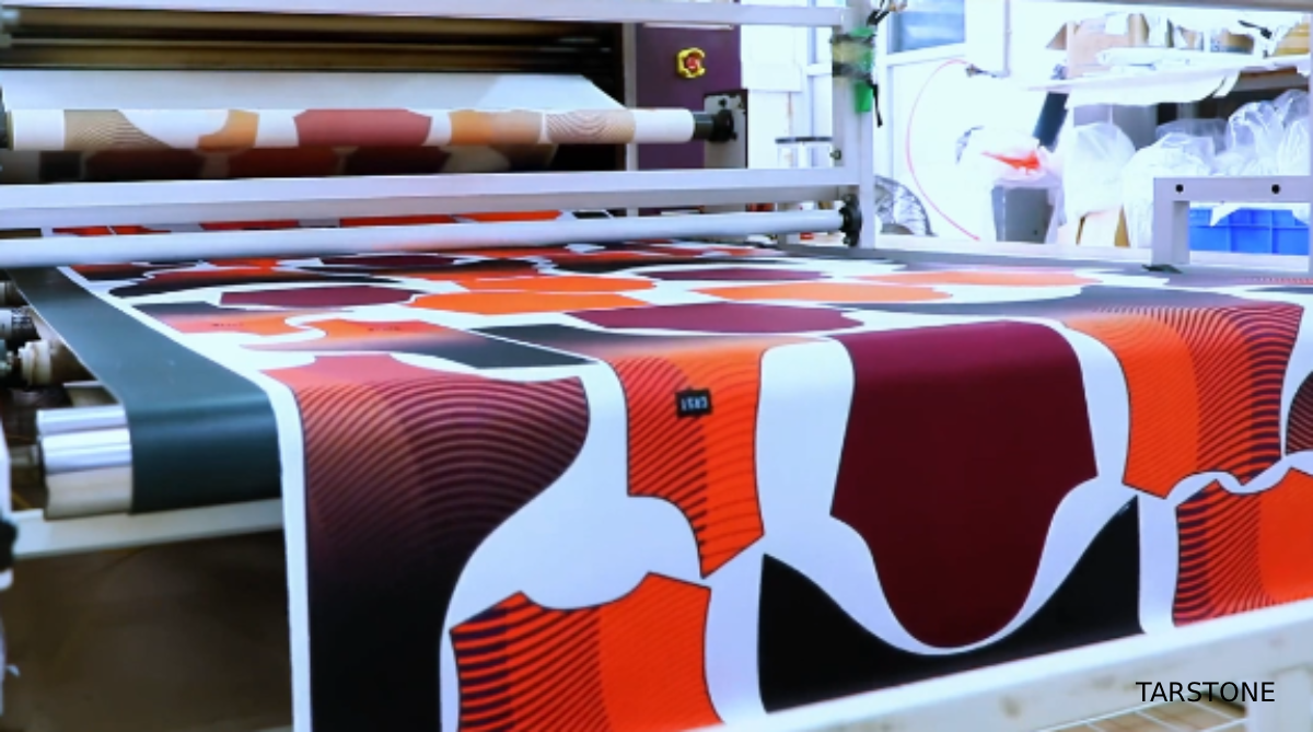
The ombre fade remains the safest bet for a team that wants to look fast without shouting. A dark navy at the hem melting into a bright sky blue at the shoulders reads as movement even when the rider is standing still. Teams with a single brand color often extend that color into a two-stop fade so the kit stays on-brand yet gains depth. We print gradients directly into the fabric through sublimation, which means the transition never cracks or peels the way a sewn panel would, and the soft edge keeps the kit looking current season after season.
2. Geometric color blocking
Bold panels of contrasting color placed across the torso and sleeves give a kit a modern, architectural feel. The trick is to let one color dominate and use the second as an accent rather than a fifty-fifty split, which can read as costume. Race teams lean toward high-energy pairings like black with fluoro yellow, while corporate or club rides prefer muted tones such as slate and teal. Color blocking also hides sweat marks better than a flat light color, a practical bonus few buyers think about up front but appreciate on a long summer ride.
3. Retro and heritage stripes
Thin horizontal pinstripes across the chest, a single broad band around the waist, or a classic three-stripe sleeve nod to the golden era of road racing and signal seriousness without novelty. Heritage looks work especially well for established clubs celebrating an anniversary or for brands building a timeless identity rather than a trend-chasing one. Keep the stripe count low and the palette restrained; the elegance is in the restraint, and a heritage kit photographed next to a modern one always looks like the more expensive option.
4. Stealth base with neon accents
A near-black or deep charcoal kit punctuated by a single neon detail—a fluoro seam line, a bright zipper garage, a glowing logo—has become the default for performance-minded groups. The dark base photographs well, hides dirt, and reads premium, while the accent gives teammates an easy way to spot each other in a pack. This is also the most forgiving direction if your artwork is still rough, because the impact comes from placement more than complexity, and a single well-placed accent can carry an otherwise simple kit.
5. All-over sublimated artwork
When a team has a story to tell, a full-bleed print turns the jersey into a canvas. We have produced kits wrapped in mountain ranges, city maps, abstract brushstrokes, and a club's own hand-drawn mascot. Because sublimation dyes the fiber rather than sitting on top, even a photographic image stays breathable and sharp across the whole garment. The only real limit is contrast at the seams, which our pre-press team manages during artwork setup so the design reads cleanly from every angle.
6. Minimalist monochrome
A single color from collar to hem, sometimes broken only by a tonal logo, is the quiet luxury of the kit world. Monochrome suits premium brands and small elite squads who want recognition through form rather than noise. It also ages gracefully—a white or black minimalist kit shot three years apart still looks current, which matters for teams that reorder the same design season after season and do not want last year's kit to look dated.
7. Centered crest or badge
Placing a circular or shield crest dead center on the chest makes the kit read like a uniform, which is exactly what corporate teams, university clubs, and event series want. The crest carries the identity; the surrounding fabric can stay simple so the badge does the talking. We often pair a centered crest with a subtle tonal pattern in the background so the jersey is not flat in photographs, and the result reads as intentional rather than empty.
8. Split personality, two-tone
A kit that presents one color on the front and a different color on the back — or a hard vertical divide down the midline — creates a split-screen identity that photographs dramatically from any angle. This direction suits duos, relay teams, and brands with two flagship colors. The risk is visual busyness, so we usually keep the two tones within the same family or separated by a clean seam rather than clashing primaries, which keeps the kit readable at speed.
9. Texture and camo prints
Heather, marble, topographic lines, and subtle camo patterns give a kit a tactile richness that flat color cannot. These prints read as premium up close and hide wear better than solids, which is why they are popular with gravel and adventure rides. A tonal camo in greens or greys is a safe entry point; a high-contrast marble is for teams that want the kit to be the loudest thing in the bunch and are comfortable standing out in the start pen.
10. Discipline-matched sets
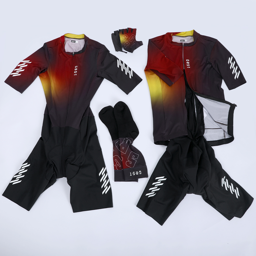
Triathlon and multi-sport groups often want the jersey, trisuit, and warmers to share a language so the whole lineup looks intentional. Designing a master pattern — one motif, three garments — keeps the brand coherent across race formats and makes reorders simpler. We build these as a single artwork system so colors stay matched across fabrics with different stretch and weight, which is the detail most teams only notice when it goes wrong.
11. Seasonal limited editions
A summer edition in bright citrus, a winter edition in deep ember, or a holiday run with a one-off graphic gives clubs a reason to order twice a year and keeps the kit feeling fresh in photos. Limited runs also create urgency among members who do not want to miss the drop. We support short runs precisely because small-batch sublimation is where a manufacturer's flexibility shows, and a seasonal color is the easiest way to make an existing kit feel new again.
12. Sponsor-forward layout
Race and charity teams live on visibility, so the design brief often starts with sponsor placement rather than aesthetics. A clean grid of logo slots across the chest and sleeves, balanced by a calm base color, keeps sponsors happy without turning the rider into a billboard collision. We help clients plan logo sizes and safe zones during artwork setup so nothing ends up unreadable at speed, and the kit still looks like a kit rather than a sticker sheet.
How to brief your direction to a manufacturer
Once you have a direction, the next step is turning it into a printable file. You do not need to be a designer — a clear reference image, your color hex codes, and a note about which elements must stay, such as a crest, a sponsor, or a race number, are usually enough for an artwork team to build a proof. If you are starting a brand from scratch, our guide to building a cycling brand covers the full path from concept to production, and our fabric guide explains which materials suit each look. The faster you can describe the feeling you want, the faster we can return a proof you will actually approve.
Turn a direction into your 2026 kit
Pick the direction that fits your team, send us your colors and a reference image, and we will return a custom proof with no design experience required on your side. Whether you are a club ordering your first run or a brand planning a full 2026 lineup, the conversation starts with a single idea—and we help you finish it.
Choosing the ideal design direction is the foundation of standout custom cycling kits for clubs and independent brands. Every style featured can be realized via full dye sublimation, delivering crisp, long-lasting prints across jerseys, bib shorts and multi-sport apparel.
Many teams waste time tweaking graphics without locking in core visual direction first. Confirm your color palette, layout logic and visual style upfront, and your factory can quickly generate print-ready artwork proofs and avoid repeated revisions.
As a professional cycling apparel OEM & ODM manufacturer with in-house sublimation printing and independent design support, Tarstone provides custom artwork development, low MOQ sampling and bulk production for cycling clubs, race teams and emerging apparel brands.
Contact us to discuss your 2026 custom cycling kit design and receive free artwork consultation and production quotation.
Email: amytong@tarstone.com
WhatsApp: +86 150 5417 8785
Website: www.tarstone.com
Inside a Cycling Jersey Production Line: Step-by-Step from Fabric to Finished Garment
How to Build Your Cycling Brand: A Complete Guide from Design to Production